
From Art Journal 71, no. 2 (Summer 2012)

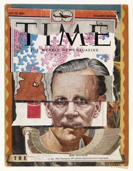
Sometime in the early 1950s, the artist Eduardo Paolozzi began making collages from the covers of Time magazine, cutting them up and putting them back together again in new ways.1 Founded in 1923, in the wake of World War I, Time still functioned as a mouthpiece for American interests stateside and abroad when Paolozzi first got his hands on it after World War II, at the height of the Marshall Plan in Europe.2 In contrast to the other collages the artist was making at the moment, which provocatively cobbled together various advertising images according to a wide range of techniques (he projected a number of these at a famous 1952 epidiascope lecture now known as Bunk!), to create the Time works Paolozzi deployed a consistent and systematic method that mimics the standardized production of the covers themselves: each of the weekly magazine’s covers displayed an illustrated portrait of a newsworthy person, his or her head situated on a contextual ground and framed in the magazine’s signature red border. Through their insistent emphasis on the face as a necessary component of depicting current affairs, the magazine’s portraits recast complex issues of national and global concern into a constantly fluctuating cast of characters, helping to inaugurate the personalization of political life we see everywhere today. In doing so, they helped instantiate a system in which political concerns could only be visualized in the figure of a personality. Rendered in a quasi-photographic, evenhanded style and turned at a three-quarters profile, however, the portraits do less to convey something of their sitters than they do to constitute a type. No matter who the subject was, the template always remained the same, and no matter the topic, only individuals were ever pictured. It was as if subjects had to be systematically extricated from social fabrics and collective possibilities in order to signify. Despite depicting individuals, the subjects within these covers appear more as systematic variations on a standard unit, mere placeholders of power. They look this way even more after one sees what Paolozzi has done to them.
Picking up on this repetition, Paolozzi cut the covers into layers and then mixed and matched them, stacking strata of physiological features one atop the other, transforming multiplied individuals into individual collages. Dispensing with the cropped disfigurations of Dada photomontage for the equal bands of the Surrealist cadavre exquis, Paolozzi somehow did away with the frisson associated with both models, the shock and the squeam alike. A vast quantity of already exchangeable faces became even more interchangeable with so many equal parts slipped out and in, the parts fitting together almost perfectly. Aside from a slight change in skin color, one would be hard pressed to guess that the person in The Return, for example, was compiled from different sources.3 While the figure is identified as the Haitian president Paul Magloire by the chopped-in-half caption at the bottom, Paolozzi seems to have left this identifying information only to undermine it. The work does not represent Magloire, nor does it offer a caricature of him. Appearing on Time seems to have been requirement enough to undergo Paolozzi’s scissors and glue. Less important than whom these portraits depicted, in other words, were their claim to humanity and power, and the fact that this power turned on generic form rather than specific content. The Return is more of a puzzle than a personal attack. The same could be said for many of the other Time collages, including From Mass Merchandising Profit and One Man Track Team, even if eyes occasionally stutter and noses divide.

Looking back at this work in the 1980s, Paolozzi told the the art historian Robin Spencer that a visual quiz from Modern Mechanix and Inventions magazine inspired the series, and a follow-up from an advertisement from the November 1935 issue—“Unscramble Photos to Win $1750.00 Cash Contest”—is tucked away in one of his Oxford scrapbooks next to an image of sewn-up corsets.4 In the “Unscramble” game, the faces of three prominent personalities have been chopped up, rearranged, and joined together to create three new faces. To win the cash prize, a contestant had to recognize one of the original three fragments. Though similar in form, the idea of the game disappears in Paolozzi’s collages, and with it the idea of a recognizable physiological feature—the mark of singularity and identity—is done away with as well. In Time Paolozzi found the perfect target to pair with this technique.
Though Paolozzi made a number of Time collages during the 1950s, they seem to have functioned more as preparatory material or research for him, part of his artistic practice if not necessarily its final product. He shared them primarily with friends, and for the most part they did not make it into many of Paolozzi’s exhibitions at the time. In 1954, however, one appeared in Collages and Objects, an exhibition Lawrence Alloway organized at London’s Institute of Contemporary Arts (ICA) that sought to chart a counterhistory of art-making.5 With its title suggesting an inversion of the traditional categories of painting and sculpture, the exhibition laid out a genealogy of collage practices that began with Pablo Picasso, stretched forth to the work of Max Ernst, Kurt Schwitters, Hans Arp, and Jean Dubuffet, and culminated with contemporary artists working in England, such as Paolozzi, Nigel Henderson, and John McHale. Though fabricated from materials similar to the other Time collages, Two Portraits stands out in comparison. Instead of sliced strips, the work comprises two heads sitting next to each other on an upside-down clipping of Italian newspaper. Leaving the face on the left untouched—it is simply a Time portrait with the logotype removed—Paolozzi seems to have covered the portrait on the right with a series of encrustations so that it took on the look of an archaic sculpture or a covered mound. With its identifying characteristics occluded, it calls to mind a figure from the past, and it is this figure, in fact, that tells us most about Paolozzi’s public work at the time, indebted as it was to the figurative work of Dubuffet and Alberto Giacometti. In a profile on the artist published at time of the Collages exhibition, Two Portraits appears on the same page as a small bronze head with an outstretched arm, a simple bust chiseled out of composition stone, and a black and blotchy drawing of a man’s head with pictures of engine parts pasted inside.6 On the opposing page is a small bronze sculpture titled Man’s Head (1953), which looks as if it had been dug out of the ground or excavated from a buried civilization.7 As with Two Portraits, it is difficult to reconcile everything one sees on these pages: the collision of the bronze figure and the magazine collage, the expanding realm of materials and temporalities that are at work, the way the archaic and the modern are placed next to one another. It is hard to know what to do with the coincidence of works that stress processes of reproduction and interchangeability with those that foreground uniqueness and singularity while nevertheless adhering to a similar form. The article remarks that Paolozzi is “investigating the limits of the significance of form.”

Wonder and Horror
A tendency to make connections between wildly different times and places was common at this moment. A year before Collages and Objects, in 1953, the ICA hosted an exhibition titled Wonder and Horror of the Human Head, organized by Roland Penrose, which offered a heterogeneous assortment of oil paintings, photographic reproductions, and artifacts from a wide range of ages and cultures, chosen, the catalogue stated, according to the criterion of “emotional content.”8 The historical breadth of the exhibition hoped to establish continuity and community between different times and places, functioning as proof of past humanity as well as a plea for one to come. In many ways, Wonder and Horror functioned as a precursor to the Museum of Modern Art’s 1955 exhibition The Family of Man, which visited London in 1956, given that both sought to lay out transcendental and unifying claims about man’s nature in the wake of a catastrophic war and under the threat of a seemingly imminent bomb through displays largely consisting of photographic documents. If the New York exhibition nervously aspired toward a feeling of global family, however, a sense of anxious community similarly motivated the London exhibition, albeit in a slightly different sense. As underlined by the wonder and horror in the exhibition’s title, the head signified both the powers of which man was capable as well as the weaknesses to which he was susceptible: “The head is not only man’s most dominating feature, in the physical sense—the seat of his controlling intelligence, the lodgement of his vision and hearing—it is also his most vulnerable feature,” the catalogue explained.9 The exhibition might be said to have had one foot on either side of the rupture caused by the war; as it looked forward to an economy of information and intelligence, it simultaneously internalized the state of ruin just behind it. The documents on display similarly edged between anxiety and awe, encompassing artifacts from ancient civilizations to the present day, including photographs of Etruscan masks, eighteenth-century Indian sun gods, works of modern art, and contemporary representations culled from popular culture. In many ways, the exhibition modeled itself on André Malraux’s “museum without walls,” with a common feature derived from wildly different objects, except that here the archive of art gave way to the stuff of mass culture. “Contemporary examples in this field are often most vigorous and spontaneous in their popular forms,” Penrose noted in a brochure accompanying the exhibition. “In commercial advertising, the illustrated magazine, and the picture postcard, many of the most ancient symbols appear in a modern guise, and this aspect of the subject is shown in the scrapbook compiled by Lee Miller.”10

Miller’s scrapbook, the very fact of which is significant given Paolozzi’s interest in the form, made a particularly strong impression on visitors to the show. In his review of the exhibition, the critic Robert Melville paid special attention to it, writing that “Miss Lee Miller added a group of popular images which included some astonishing recrudescences: a French poster for a hair-tinting preparation, a double-headed dark and fair image of a girl, formed a bizarre link with a Byzantine triple-headed Christ, and the poster of a girl wearing a huge camera and staring through its lenses was an enormity which brought to mind a Zapotec funerary urn.”11 Melville was struck not so much by the contemporary ads themselves but by the way they matched up with older forms, marking, as he put it, a “recrudescence.” Archaic images were clearly enjoying a renaissance in commercial culture; the “field” was expanding from pagan relics to “picture postcards,” from masks to “illustrated magazines” (one might think here of the Time covers), with a consistent line of iconography woven throughout. Indeed, to many it seemed that contemporary popular culture had made the archaic available once again. With the past percolating into the present, the two were bound together, “the most ancient symbols” appearing in “modern guise,” initiating a temporal collapse that created a smooth passage between radically different periods and places. Clearly, there was a desire for historical continuity at this time, and the head was thought to be the most basic unit of universal communication that might link them together.12 The purpose of the exhibition, Herbert Read wrote in the preface to the Wonder and Horror anthology, was to display “the unchanging nature of a myth” and “the eternal recurrence of an archetype.”13 The emphasis on the expressivity of “heads” and “families” in the abstract, undefined by culture or context, is inextricable from the period.

By portraying the head as generic and manufactured, Paolozzi’s Time collages clearly form a counterargument to this line of reasoning, opposing the humanity, vitality, and myth championed in Wonder and Horror. Far from foregrounding “emotional content,” these works emphasize systematicity, vacancy, and techniques of reproduction. A number of newspaper clippings found in Paolozzi’s scrapbooks from this period would seem to adumbrate such a position. A photo of two men staring down at a bust of a dummy on an X-ray table, for example, appears with the caption, “A stand-in for a living man, Mr. Cruikshank has helped solve problems relating to X-ray equipment of deep brain tumors. His wooden noggin, sectioned to hold film, has the same X-ray absorption properties as the human head. He poses before a two million volt X-ray generator in Massachusetts Institute of Technology. His name, picked at random, has no special significance.”14 Stories about Mr. Cruikshank recur throughout Paolozzi’s scrapbooks at this moment, and as early as 1950 the artist fabricated a bust with the same name, a kind of replica of its namesake featuring a blank and steely visage. Like the original Mr. Cruikshank, this sculpture is nothing but dense matter, and as such, it protests our desire to derive meaning from the human face and the art object alike. If this is the case, however, one still has to ask how to reconcile such a work with the other half of Paolozzi’s practice, what we might call his brut production, which followed closely on the heels of Dubuffet. Do these latter works not fall into the trap set by Wonder and Horror? Indeed, is Two Portraits not a Wonder and Horror in miniature, putting the modern and archaic in parallel with one another? To the contrary, if these works investigate the “limits of the significance of forms” they do so to undermine the stability of myths and archetypes.
Archetype and Cliché
For the most part, the discrepancies between Paolozzi’s two modes of production have allowed historians to push his two bodies of work too far apart, if not to discuss one exclusively of the other. Writing in the 1976 exhibition catalogue Pop Art in England, Frank Whitford claimed that while
critics are right to recognize Paolozzi’s contribution to the basic iconography of Pop . . . they have emphasized it too much in relation to his own work. The sculpture of this period reflects almost nothing of those interests proclaimed in the [Bunk!] “lecture.” Paolozzi’s interest in the whole range of popular imagery remained largely private for some time, confined to his sketch-books and scrap-books and most clearly expressed in public only in a series of small exhibitions he helped to organize and which consisted largely of photographic material culled from a wide variety of popular and technical sources [the exhibition Parallel of Life and Art].15

While much revisionist history of Paolozzi’s practice was certainly being written in the early 1970s after the emergence of Pop art—most notably by the artist himself in his 1971 retrospective at the Tate Gallery, in which he ham-fistedly positioned himself as a Father of Pop—to make a statement such as Whitford’s is to miss the connections between Paolozzi’s two modes of working at this time. Indeed, one needs to look at Paolozzi’s practice holistically to understand how the popular sources so evident in the Time collages function as a ground for Paolozzi’s brut production. The black marks scored over the Time faces, for example, might be seen as attempts at extricating and exposing a generic, “universal” structure from these media icons. Excavating the word Time beyond its function as a magazine’s title, moreover, one sees that it evokes an empty, homogenous temporality—one that can reach forward and back between past and future without touching on any particularities. In fact, despite their lack of popular materials, Paolozzi saw his sculptural works as responding to popular culture. The 1954 profile of Paolozzi stresses the point: “His most recent work has been conditioned by magazines like Vogue and Time, and is concerned with characteristic phases of modern life,” the article reads. “He intends it to be immediately recognizable as such. The most important are ‘The Woman Thing,’ a frivolous woman in a Bra and Big Hat, and ‘The Man Thing,’ a contemplative man holding a Cigarette.”16 Paolozzi never meant to hide his interest in mass culture— “he intends it to be immediately recognizable as such”—and yet at the same time he largely refused to invoke it in public with its own materials, rather choosing to use it as a conditioner informing the production of his work.

One can see this conditioning at work in a number of small sculptures that correspond to the categories laid out in the article, including Figure (1952), Little Woman (1957), and Man Smoking (1956), in which certain modern poses and pastimes provide prototypes for the works. In the middle sculpture a crudely rendered female form endowed with large breasts and a dented pudendum stands with her arms akimbo atop her head. Little interest has been paid to her anatomy or bone structure—indeed, the figure more closely corresponds to the shape of Paolozzi’s hands than to the form of any female body. The rough handling evident in the divots on the figure’s thighs evokes the impressions of the artist’s fingerprints, and the woman’s toothy grimace has seemingly been indented with a fingernail. In contrast to the tenuous, poignant figures made by Paolozzi’s contemporaries, artists such as Lynn Chadwick and Reg Butler, everything is clumsy and childlike here, not to say primitive. Its pedestrian subject matter distances it from Giacometti and Dubuffet’s figurative sculpture as well. As this figure evokes a fetish in its raw construction, it nevertheless shares similarities with the figure of the pin-up girl so prominent in the glossies of the day. Something similar might be said of Paolozzi’s Man in a Motor Car (1955), an equally crude assemblage crafted from wax and subsequently cast in bronze. There is no prodigious handling of material here either—the figure has been pinched together in the most basic of fashions and plopped on an odd three-wheeled box dripping with lesions of wax. Rather than evoke the Futurist triumph of the man-machine or take part in a contemporary excitement over automotive styling, Paolozzi ironically presents a man in a car as an archaic archetype.

Allying himself partly with Dubuffet’s interest in art brut and partly with the Brutalism of his colleagues Alison and Peter Smithson, Paolozzi publicly identified himself as a Brutalist at this time, and I want to suggest that it is in these sculptures that Paolozzi’s Brutalism emerges.17 Though primarily a term used in architectural discourse, Brutalism’s interest in the “as found” and its aspirations to “memorability as an image” clearly speak to art practice as well.18 “Any discussion of Brutalism will miss the point if it does not take into account Brutalism’s attempt to be objective about ‘reality’—the cultural objectives of society, its urges, and so on,” Alison and Peter Smithson declared in 1957. “Brutalism tries to face up to a mass-production society, and drag a rough poetry out of the confused and powerful forces which are at work.”19 If the Smithsons wanted to meet the realities of contemporary society head on, they also wanted to show what was underneath it, what made it tick, and Paolozzi’s work from this period attempts something similar. Using mass culture as his ground, he attempted to push against it and pull back its surfaces in order to show the impulses behind it. Paolozzi’s sculptures, in other words, employed archaic mediums and techniques in order to critically reflect on how modern culture invoked the archaic, how the summoning of “man” and “woman” in the mass media called out to archetypal models from the past. His figures are composite characters or mean averages of contemporary representations added up and crudely divided. “Some of Paolozzi’s forms certainly refer to art traditions, but only in the way in which he also refers to ads in the New Yorker, exhibits in the Natural History Museum, or strips in a comic book,” Alloway wrote in an article on the artist published in 1956, expanding the point. “Paolozzi, more than any other artist working in England, integrates the modern flood of visual symbols, a primary fact of urban culture, with his art.” “The images he collects—of a sexy model girl, a mutilated war veteran, an aerial view of a city, and so on—do not in themselves set his imagination working. Rather, when he draws or models, his experience of visual symbols (art and non-art) is part of his way of seeing.”20

As Alloway makes clear, Paolozzi does not use contemporary subject matter straight, but incorporates the way it is seen and the forms of vision it presupposes into the making of his work. More important, Alloway locates Paolozzi’s sculptures in the context of his Bunk! collages—with elements such as a sexy model girl and a mutilated war veteran—while also invoking ideas present in the 1953 ICA exhibition Parallel of Life and Art, which Paolozzi organized with the Smithsons and Henderson, about contemporary images and advanced photography providing new ways of seeing. Popular culture not only provides symbols but creates a wide field of competing visions, creating confusion and ambiguity while also opening up the possibility for creating images dense with information. Despite all this interest in iconography and technology, however, Alloway ultimately took an existential note in regard to Paolozzi’s work, reasoning that the artist tested the limits of the human only to uphold them. “The consuming interest of Paolozzi is with the physiological and psychological limits of man,” Alloway wrote. “These limits have been widened lately, with concentration camps, exposure at sea, the pressure of -45 gravities. It is to find an image of man tough enough and generalized enough to stand up in this environment that Paolozzi is working.”21 If Wonder and Horror wanted to prove that the present was effortlessly in line with the past, Alloway imagined Paolozzi’s sculptures somewhat similarly—as depicting man enduring into the present. As we have seen, however, Paolozzi viewed his work rather differently. His sculptures showed how the present moment actively, and awkwardly, attempted to produce the past, as well as a sense of continuity with it, by self-consciously and parodically internalizing the archaic aspirations of modern culture. One was meant to view these sculptures, in other words, as clichés.

As Marshall McLuhan once noted, there is a sliding scale between cliché and archetype; an archetype, he wrote, is nothing more than “a retrieved cliché—an old cliché retrieved by a new one.”22 While the archetype is typically thought of as an original and ideal model (arche, in Greek, means “origins”), McLuhan imagines it as the simple compounding of two clichés brought together across geography and time. “Archetypes are in reality nothing but clichés,” Fredric Jameson wrote later in another context, “only they are clichés before the fall, the received ideas of an older and socially more vital culture. . . . The essential difference between [the two] . . . is not a generic or stylistic one, but rather the difference between two situations, a contextual variation between two distinct modes of production and two different moments of history.”23 The invocation of an old archetype in a new context, and vice versa, would show the distance between two historical periods, and the impossibility of reclaiming the former. The originality ostensibly supporting the archetype is revealed as always already manufactured—a trite stereotype—just like the cliché. By fixating on iconography and seeing it, rather than techniques of reproduction, as the fundamental contribution of mass culture, Paolozzi’s sculptures insist on the timeless and humanistic pretensions of the mass media, and how far they are from current reality. Though Paolozzi’s hand-making of the readymade might look like an attempt to insure a ritualistic and “primitive” subjectivity, it ultimately shows such a way of being to be impossible and beyond reach. The critical power of his works emerges in the fact that in beholding them one gazes on one’s contemporary moment—its fashions and clichés—as if they belonged to a long-lost era. The pin-up girl, the cigarette smoker, and the man in the motor car are shown as relics belonging to the past. We, too, they say, are on the way out. When looking at these sculptures, one is meant to alternately worry and nervously laugh.
Alex Kitnick received his PhD from the Department of Art and Archaeology, Princeton University, in 2010, and has taught at Vassar College, the School of Visual Arts, and UCLA. In 2011–12 he was a postdoctoral fellow at the Getty Research Institute in Los Angeles. He recently edited a book in the October File series on Dan Graham, October 136 on “New Brutalism,” and The Expendable Reader: Articles on Art, Architecture, Design, and Media, 1951–1979, which collects key writings by the artist John McHale.
- Though Paolozzi first came into contact with Time in Paris—through the wives of American GIs—he seems to have had continued access to them on returning to London. See Eduardo Paolozzi, “About the Prints: The Artist Talking at an Interview,” interview with C. Hogben and E. Bailey, in Bunk!: A Box-file of Images in Print, ed. F. Whitford et al., exh. cat. (London: Victoria and Albert Museum, 1973), n.p. ↩
- In 1941, Time’s publisher, Henry Luce, infamously described the twentieth century as “the American century” in an attempt to endow the spatial expanse of the United States with a temporal dimension whose time, he believed, would soon dawn the world over—if it had not already. See Henry Luce, “The American Century,” Life (February 17, 1941), 61–65. ↩
- In The Return Paolozzi did away with the red border of the original magazine cover and most of the logotype, and placed his collage within another space of reproduction—an excised page from a mass-market art book. Though Paolozzi covered over the painting reproduced on its page, he left its identifying information intact. This is the origin of the work’s title (The Return), one possible date of its production (1944), and the soft blue border that encloses the image, which is not so different from the red frame of the magazine. ↩
- The Eduardo Paolozzi Foundation in London holds this scrapbook. ↩
- The exhibition ran from October 13 to November 20, 1954. ↩
- See Bill Cowburn and Michael Pearson, “Eduardo Paolozzi,” 244: Journal of the University of Manchester Architecture and Planning Society 2 (Winter 1954): 16–19. ↩
- This sculpture was first reproduced in The Architectural Review (November 1953). “Two small bronzes of male heads by Eduardo Paolozzi call for comment,” Robert Melville wrote. “They are different from anything he has done before: they are perhaps conceived in a spirit of homage to the remarkable French painter Dubuffet, whose work has never been shown in London. They share with a lot of other modern sculptures the look of having been dug up, and fit neatly into the category of sophisticated primitivism, yet they express a more deeply felt experience than the sum of their affinities suggests. It is as if the artist had worked in the atmosphere of the street accident and the brutal hold-up, subjecting the heads not to what is called a merciless insight into character but to a violent physical assault. It is as if he were trying to find out if the human look could survive such treatment. It has done so; it comes out strong and intact from the battering, and in their odd way these little bronzes are the most optimistic works I have seen for a long time.” Robert Melville, “Exhibitions,” Architectural Review, November 1953, 331. The same sculpture was subsequently reproduced in Reyner Banham, “The New Brutalism,” Architectural Review, December 1955. ↩
- Herbert Read, foreword to Roland Penrose, Wonder and Horror of the Human Head: An Anthology (London: Lund Humphries, 1953), 5. ↩
- Ibid. ↩
- Roland Penrose, foreword to Wonder and Horror of the Human Head, exh. broch. (London: Institute of Contemporary Arts, 1953), n.p. ↩
- Robert Melville, “Exhibitions,” Architectural Review, May 1953, 339. Melville provided a helpful inventory of items in the exhibition: “simplified cycladic heads; featureless egg-like heads which were sinister in the paintings of Chirico, serene in the sculpture of Brancusi; ferociously inventive tribal masks; examples of analytical cubism; Durer’s experiments with architectural heads; and Klee’s exquisite ‘Portrait of an Acrobat’ in which the lines defining the head also refer to performances on the high wire.” ↩
- See, for example, Rudolf Wittkower, “Interpretation of Visual Symbols in the Arts,” in Studies in Communication (London: Secker & Warburg, 1955), 109–24. ↩
- Read, 5. ↩
- The scrapbook, AAD/1985/3/6/4, was compiled between 1947 and 1952 and is held in the Krazy Kat Arkive, Victoria and Albert Museum, London. ↩
- Frank Whitford, “Who Is This Pop? The Early Development of a Style,” in Pop Art in England, ed. Uwe M. Schneede, exh. cat. (Hamburg: Kunstverein in Hamburg, 1976), 18. ↩
- Cowburn and Pearson, 17. ↩
- “I understand that Paolozzi, in common with some young architects, now calls himself a ‘brutalist,’” Robert Melville wrote in 1954. Melville, “Exhibitions,” Architectural Review, May 1954, 343. ↩
- See Reyner Banham, “The New Brutalism,” Architectural Review, December 1955, 354–61. ↩
- “The New Brutalism: Alison and Peter Smithson Answer the Criticisms on the Opposite Page,” Architectural Design, April 1957, 113. ↩
- Lawrence Alloway, “Eduardo Paolozzi,” Architectural Design, April 1956, 133. In addition to Paolozzi’s wax figure Man in a Motor Car (1955) and Man Looking Up (1955), Alloway reproduced Alex Schomberg’s cover painting for the sci-fi magazine Startling Stories, further emphasizing this pop milieu. For more on this, see Alloway, “Technology and Sex in Science Fiction: A Note on Cover Art,” Ark: Journal of the Royal College of Art 17 (Summer 1956): 20. ↩
- Alloway, “Eduardo Paolozzi,”133. Compare Alloway’s comments on Dubuffet a year earlier: “He works with the human being on a level below that of differentiation by identity cards and grading by psychological tests. His human beings, like Michaux’s are tough, interchangeable, and struggling.” Alloway, “The Facts of the Matter and the Figures Involved,” Art News and Review, April 16, 1955, 2. Two years later, Alloway wrote something almost identical on Paolozzi: “The human image he creates is a figure that obstinately survives violence and change. It is a human being below the level of dog tags, identity cards, telephone numbers, and street addresses.” Alloway, “London Chronicle,” Art International 2, nos. 9–10 (December 1958–January 1959): 36, 101. ↩
- Marshall McLuhan with Wilfred Watson, From Cliché to Archetype (New York: Viking, 1970), 21. ↩
- Fredric Jameson, Fables of Aggression: Wyndham Lewis, the Modernist as Fascist (1979; London: Verso, 2008), 80. ↩