
From Art Journal 74, no. 4 (Winter 2015)
When design is excellent, graphics reveal data, writes the infographics guru Edward Tufte.1 Good information graphics allow the reader to see relationships not apparent in data without visual form. In principle, such graphics do not impose interpretations but, by showing relationships, make interpretations possible. In Tufte’s oft-quoted phrase: “Good design is clear thinking made visual.”2 Things become considerably more difficult, however, if, pace Tufte, your analytic goal is to complicate rather than to simplify, to open multiple avenues of inquiry, and, most important, to challenge the stability of underlying data, in fact or in principle.
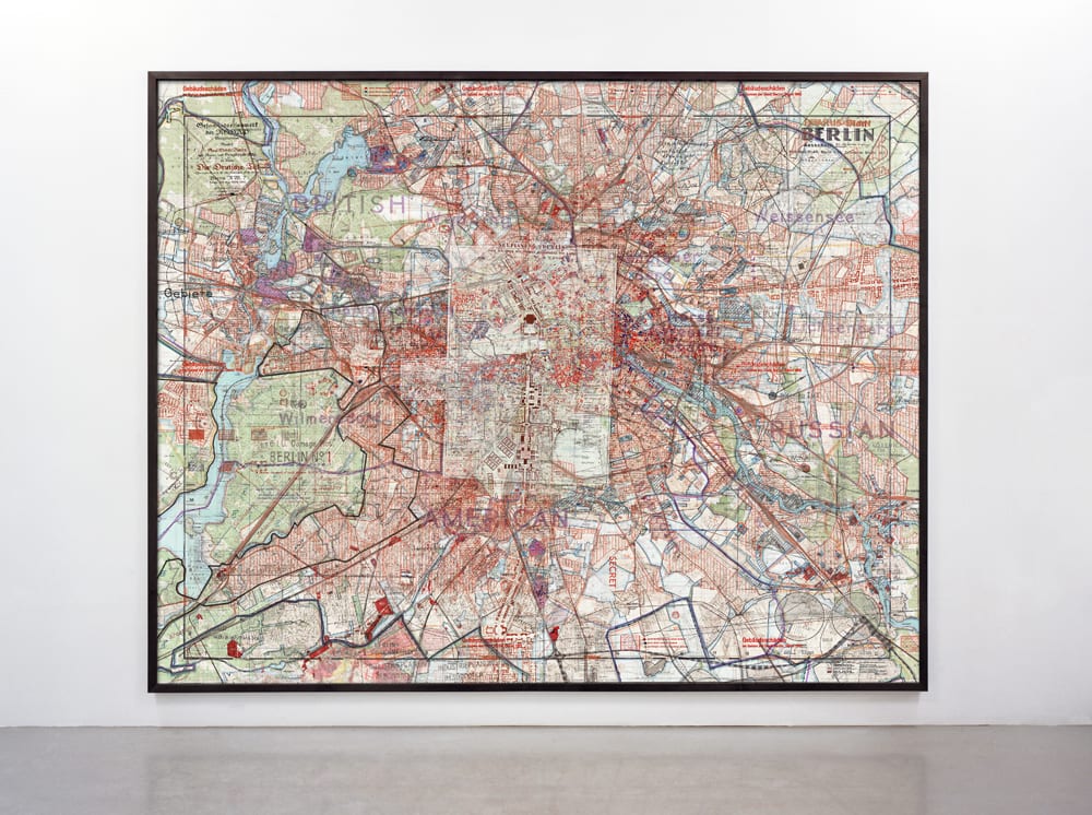
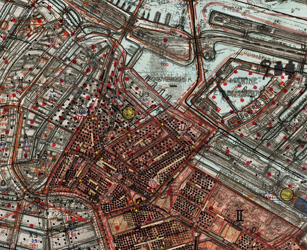
All of these complexities are probed intensely in Depictions, an ongoing print series by the Dutch artist Gert Jan Kocken (b. 1971). Depictions consists of room-size maps of European cities during the Second World War—Rome, Vienna, Munich, and Berlin along the north-south axis of fascism; London, Rotterdam, Amsterdam, Łódź, Warsaw, and Stalingrad along the east-west corridor of conflict—each built up in layers from dozens of source maps unearthed in archives. Kocken’s three-by-four meter Depictions of Berlin, 1933–1945 (2010), for example, is constructed from 104 historical maps, which the artist scanned, georectified, layered into a single digital image, and rendered as a C-print. The resulting composite is a welter of information representing the breakneck change, contradictory claims, and massive data production of the Second World War.
Visually, Kocken’s Depictions are both familiar and strange. Anyone who knows Berlin, particularly the internal borders drawn in 1945 and ossified in the Berlin Wall that remain central to the city’s identity, will easily recognize the terrain of Depictions of Berlin. But other cartographic ghosts visible in the work are invisible on the ground. In Kocken’s map, along with the outlines of the wall, we see the process of ethnic cleansing as registered in contemporary reports, the footprint of Germania, the megacity with which Hitler intended to replace Berlin, and the view from Allied bombers. At once, the Depictions series draws on the data-rich tradition of monumental history painting, as seen, for example, in Albrecht Altdorfer’s The Battle of Alexander at Issus (1529), and on the defocalizing, allover paintings of Jackson Pollock, Lee Krasner, and other artists working in the 1940s and 1950s. Kocken’s Depictions are simultaneously narrative and aleatory.
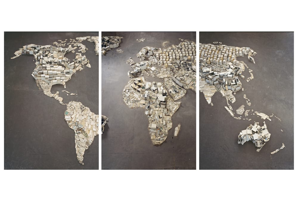
The appropriation of maps by artists is not uncommon. Here, Kocken finds himself in good, diverse company in contemporary art, ranging from Nina Katchadourian’s dissected maps, which resemble biological specimens under glass, to Ed Ruscha’s ethereal street maps, to Vik Muniz’s WWW (World Map) (2008), made of castaway computer parts, to Maya Lin’s cutaway topographies. Indeed, the list of artists who have engaged with maps as material seems almost endless, as does the list of aesthetic programs they embrace. Moreover, in the current environment, in which data graphics are of such high interest, maps in general, and thematic maps in particular, are of special concern.


In contrast to many of these approaches, however—and here the excisions of Katchadourian and Lin offer a particularly striking contrast—Kocken’s exploration of maps stays within the cartographic idiom. He does not lift maps out of themselves or reconstruct them in unfamiliar mediums; rather he layers maps deeply into one another. Moreover, in Kocken’s work, the cartographic data itself is central to the artistic claim.
For Kocken, the map nearly always serves as a device for engaging problems of historical presence and absence, a core theme of his work, from Disaster Areas (1999–2005), haunting landscape photographs of sites taken years after a calamity, to Defacing, his recent photographic series, on the religious iconoclasm of the sixteenth century (2007–9). Most of Kocken’s work has a substantial archival dimension. Indeed, for all of the visual force of his images—the photographs of his defacings are razor-sharp and nearly full size—to a great extent, it is research that makes Kocken’s art. We see this research, for example, in the painstaking network diagrams at the heart of his 2013 exhibition at Motive Gallery in Brussels, But We Cannot Speak about the Atoms in Ordinary Language, which traced the history of the Manhattan Project, and in the debunking of curatorial myths performed in his meticulously documented series Judenporzellan (2009).


Arguably, Kocken’s interest in maps and archives comes together most vividly in a photograph of a British Ordnance Survey map of the Belgian town of Ypres from the First World War; it appears in his installation series The Past in the Present (2004–8). At a glance, the Ypres map in Kocken’s photograph is mostly a mess. The depicted copy, employed by the British Army at the Battle of Ypres as a record of troop positions and battle actions, was heavily handled and densely annotated. Underneath grime, fingerprints, and innumerable marks indicating explosions, sections of the original survey map nearly disappear, overwhelmed at once by the physical conditions of war and its hyperproduction of data. This work may also be characterized as an exploration of “data” in the etymological sense of “givenness.” In this way, the Ypres map is a paradigm of the data of data.3
An ideal in infographics might be something like a self-interpreting artifact. The Ordnance Survey map in The Past in the Present could rightly be called self-obscuring. It offers a troubling but potent model of graphic production, one that inheres in history, which Kocken explores extensively in Depictions.
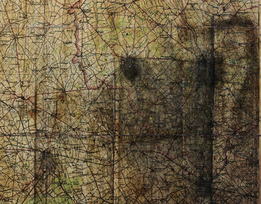
From the point of approach, Depictions resembles and differs from The Past in the Present in notable ways. It resembles the earlier work as a kind of research art, since the foundation for both series is archival. Both are also examinations of the aesthetic dimensions of data representation. But whereas the overwriting of the map in The Past in the Present is inherent in the historical artifact, it is Kocken who layers the map in Depictions.
Each work in Depictions begins in the archives, where Kocken collects dozens of maps from the Second World War, from as many perspectives as available. In many respects, Kocken’s results are governed by this data, as every map layered into the composite remains visible to some degree. Everything that he finds in the archives, representions of all kinds of data pertinent to the war, is displayed. At the same time, Kocken orchestrates the division between foreground and background through different degrees of opacity. This method gives him some control, but a strong aleatory element remains in the work. Color, design, and layout are all native to the source artifacts. The placement of a “secret” stamp shining through from an American map depends on the eye of an anonymous army clerk from back in the day.
What happens when maps of the same place at different times or from different perspectives are seen together? What happens when maps with different temporal horizons, such as survey maps directed backward in time and city planning maps envisioning the future, are projected as one? In Kocken’s cartographic palimpsest of Berlin, national and international borders flicker, Albert Speer’s plans for the monumental National Socialist city of Germania commingle with Allied bombing maps, and neighborhoods marked Judenreine Gebiete (areas cleansed of Jews) are leveled entirely.
In the most literal sense, these maps are at war with one another. In their own ways, Speer’s plans for Germania, Britain’s bombing surveys, and the zones of Allied occupation as laid out at the Yalta Conference each depict the destruction of the Weimar-era city. Yet somehow, even today, the traces of all of these cities—the Weimar city, the National Socialist city, and the Cold War city—remain and interact in Berlin, as they do in these depictions.
A riot of information, Depictions of Berlin certainly fails some of the canonical tests of good infographic design. It is not that the work is unreadable in the plane of information. On the contrary, Kocken brings key data forward, manipulating the underlying maps using color and opacity to draw things together and, where useful, hold them apart.
Because the maps speak different languages, literally and figuratively, there is no single key to the composite; there are many. Moreover, from a historical point of view, each map functions as a legend for the other maps: that is, while we may read an individual map according to its own terms and, if available, a key, in Kocken’s arrangement, we are pushed first and foremost to read the maps in terms of each other. The Yalta Conference maps of postwar Berlin are a historical refutation of Speer’s vision for Germania. In the same measure, the Nazi maps of an ethnically cleansed Berlin are a tragic sequel to the planning grids that underlie them.
In Depictions of Berlin, land is all around but there is no solid ground, no value-free terrain. Indeed, in some ways, it is the deceptively tranquil blue of the Havel and the Spree rivers that anchors these conflicting geographies. The narrative of the Cold War clearly demonstrates that these waters were as permeated by politics and history as the dry land. Invisible cities are articulated over and over in Depictions of Berlin, as the city was remade and unmade during the years of war.
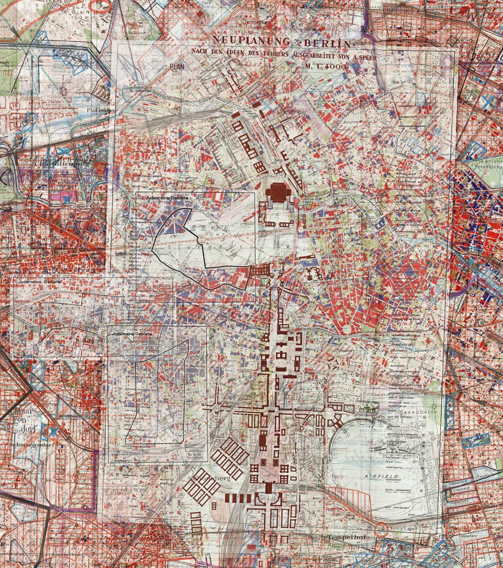
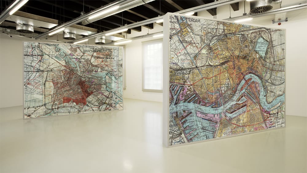
In Depictions, then, visual clarity does not indicate informational clarity and may even be its opposite. Clarity, the work argues, is useful exactly where it is historically useful and nowhere else. The argument plays itself out somewhat differently for each of the cities treated by Kocken. In Depictions of Amsterdam, 1940–1945 (2010), a crucial story evoked involves the identification of Jewish neighborhoods during the German occupation. Here, Kocken uses a notorious map commissioned by the German occupying force in 1941 and produced by the Amsterdam civil service. On it, one dot represents ten Jewish residents.
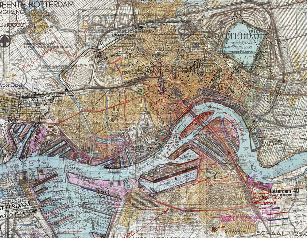
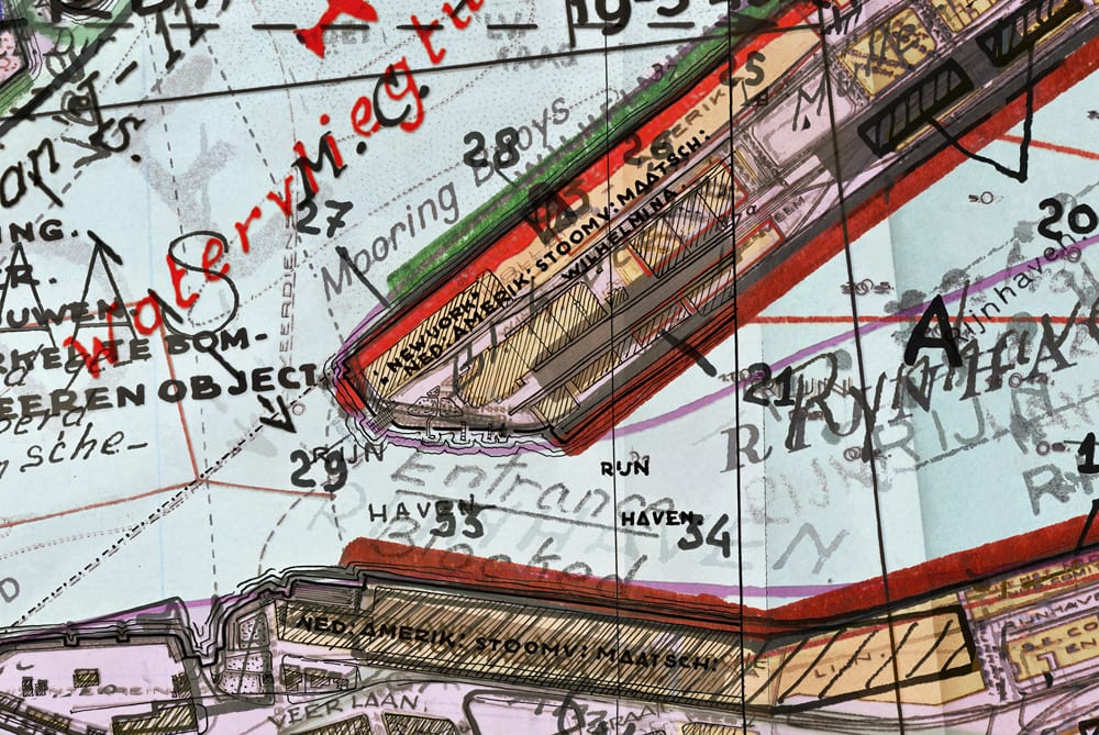
There is a curious resonance here with a different dot map produced by the local government in Rotterdam. In this map, which Kocken integrates in Depictions of Rotterdam, 1940–1945 (2010), displayed alongside the Amsterdam map, each mark represents bomb damage. In both maps, there is a powerful play of presence and absence. As drawn, the Amsterdam map shows where Jewish families lived. As put into effect, it also shows whence these families were deported and killed. On the Rotterdam map, dots effectively indicate places that ceased to be places under bombardment. In both, the relationship between the data and the war is urgently posed.
The implications of Kocken’s composite map of Rome are visible at the surface but also elusive. In this map, there is a palpable tension between the historical lightning strike of the Fascist years and the long, cartographic history present in every spot in the Eternal City. These resonances were, of course, central to the Fascist conception of Rome, as they were to Hitler and Speer’s conception of Germania. The war maps of Rome show the city in a different light. The Vatican and the historical center are crossed off the bombing maps while an alternative geography within the same grid—a power station, oil refinery, and weapons manufacturer—comes to the foreground. British bombing records indicate areas of little information where smoke obscured reconnaissance.
Viewed up close, each of the Depictions reveals a remarkable level of detail and a struggle for place fought block-by-block. Though massive, the works invite the viewer into neighborhoods that may no longer exist and stories that were so often terminal. When displayed in Europe—Depictions of Amsterdam is exhibited at the Jewish Historical Museum in Amsterdam—these pieces resonate as aesthetic objects and repositories of information.
149⅝ in. (280 x 380 cm) (artwork © Gert Jan Kocken; photograph provided by the artist)
In relation to my own family, the map of Rotterdam is particularly poignant. In December 1938, after a brief internment in Buchenwald, my father’s family fled from Germany to Holland. For more than a year, they lived in a refugee camp at Wilhelminakade 74, in an old hotel on the quay within eyeshot of the moorings of the Holland-America line, and right at the center of Kocken’s Depiction of Rotterdam.
As the map shows, the Wilhelminakade was the eye of the Rotterdam storm. In the five years depicted by Kocken, the camp lived several lives, as a point of escape, a place of blockade, and eventually a reopening to the world. Already at the war’s start, Wilhelminakade 74 had seen better days, and it was shortly to see ones much worse. My grandparents, along with my father and uncle, were able to embark for New York from directly in front of the camp on February 10, 1940. Aboard the SS Volendam on the two-week crossing, my father and his brother watched The Wizard of Oz over and over, and strolled the decks with elegant passengers whose photographs appeared in the society pages when the ship arrived in New York.
Things went badly for my great-grandmother and great-uncle, who remained in Holland waiting for a ship later that spring. The German invasion of Holland began on May 10 and was complete in only five days. At 1:22 p.m. on May 14, the German bombardment of Rotterdam began. Within a day, the old center city was bombed flat. The Dutch barely had a chance to scuttle the Holland-America vessels that remained in the harbor. But they did, and my great-uncle and great-grandmother, along with many others, were trapped. Saemmy died at Auschwitz. Theresa died at Theresienstadt. Photographic views of a flattened Rotterdam after the bombardment resemble nothing so much as the street maps that serve as Kocken’s raw material.

In the representation of history, clarity often demands simplification. But historical understanding also demands confrontation with complexity, ambiguity, and a multiplicity of perspectives. For better or worse, on a data map, this information sometimes looks like a jumble. One may view Kocken’s Depictions as examples of data art. Certainly, the works are built from data, and part of the elegance of his approach is that important data remains available even when entangled. Moreover, bringing these maps into relation with one another creates new perspectives in ways consistent with usual practices of data graphics. Yet, the Depictions also offer a graphic critique.
Consider, in contrast, a war map designed in 1869 by the French engineer Charles Minard, which, thanks to Tufte, has become a widely accepted model of infographic excellence; the Carte figurative des pertes successives en hommes de l’Armée Française dans la campagne de Russie 1812–1813 depicts the destruction of Napoleon’s army during its assault on Russia. Minard’s map is in every way an exemplar of what Tufte calls “graphical elegance.”4 It brings together several key data fields—time, location, force strength, and, crucially, temperature—making visible in a single stroke the power of the winter that crushed Napoleon’s Grande Armée.
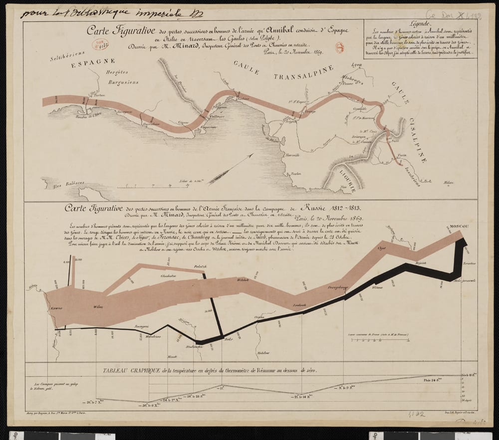
Minard’s “figurative map” is a marvel of economy. Not only does it combine all the data, it rigorously excludes everything else. Both this data and the map are stripped to the barest necessary outlines. Indeed, the map itself is little more than an arrangement of city and river names suggesting scaled space. Meanwhile, Minard was careful not to ink his quantitative infographics too darkly, so the geographic terrain remains visible beneath the quantitative data.
Since Tufte, Minard’s map of Napoleon’s march to Moscow is often presented alone, but Minard himself usually presented it in combination with a map of Hannibal’s expedition across the Alps, which he based on the account of Polybius, using the same visual strategies. At the beginning of the campaign in Spain, Hannibal’s troops numbered ninety-seven thousand. At the end, somewhere between Turin and Milan, only six thousand remained. The juxtaposition of Hannibal and Napoleon creates a specific context of argument and again speaks to the economy of Minard’s method. In this case, the juxtaposition serves to transform the maps from accounts of individual events into exemplars of imperial overreach, the historical power of geography, and the self-destructive cycles of war.
For all of its resonances with Minard’s approach, Kocken’s Depictions offer no such clarity. There are two principal sources of visual lightness in Kocken’s Berlin map: Speer’s plans for Germania, which hover like a white mist over the cityscape, and the kabuki faces of zones marked Judenreine Gebiete. Though massive and dense, Kocken’s Depictions are not abstruse. At the same time, they put pressure on our expectations about representational transparency. Just as Minard’s juxtapositions determine in important ways the argument of his diagrams, so too do Kocken’s.
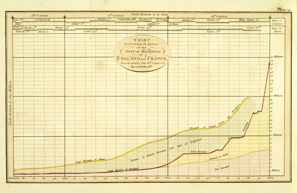
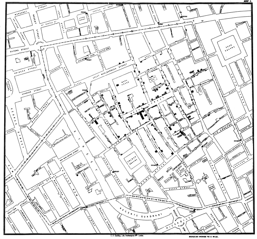
Part of what makes Tufte’s 1982 book, The Visual Display of Quantitative Information, so interesting is its engagement with the history of graphics. Tufte’s aim was to derive design models applicable across time and place, so he went to historical sources to find proven methods. Many of the old graphics unearthed in the book, such as William Playfair’s 1786 line graphs of the British economy and John Snow’s 1854 map of the clustering of cholera cases in London, are extraordinary both in their form and influence. Others remind us of overlooked graphic possibilities, paths less taken.
But, in many cases, Tufte’s examples are so good that they illustrate more than just principles. When we look at Minard in light of Kocken, we also see the grain of the work, the freehand of the engraver’s stylus, and an argument that determines a surprising approach to the data.
Minard’s account of the military campaign of 1812 to 1813 boils down to Napoleon versus the Russian winter. Yet historical dates and temperatures are entirely lacking on Minard’s chart during the march toward Moscow in summer and fall. According to the chart, by October the Grande Armée had already been reduced from four hundred twelve thousand soldiers to only one hundred thousand. By percentage, the winter months of the campaign were the most fatal. Winter losses were 90 percent. But losses during the summer and fall were fully 75 percent, and in total numbers, more than three times larger.
In general, Minard’s charts are characterized by a studied reticence. How many soldiers were killed in battles? How many wandered off? How many were done in by cold, hunger, disease, the brutal pressure of exhaustion, or the failure of the campaign?
Of course, the poetry of Minard’s chart lies in his bold choices, the data he presents, the data he leaves out, and the remarkable reduction of the background geography to a visual index. An innovator in the field, Minard was not bound by the conventions of graphing. While he was driven by an engineer’s sense of exactitude, the hand of the artisan is tangible in his product.
The power of Minard’s image is as much historical as it is informational. By historical, I am not referring to the history represented in the diagram—the history of Napoleon’s wars—but rather to the history of Minard’s own time embedded in the diagram. Among other things, this graphic was drawn. It comes from a time when—despite pervasive fantasies of mechanization—the work, even the data work on the back end, was done by hand. To indicate trade and transportation volumes, in other influential works, Minard drew thin and thick lines, and large and small dots. Today, we think of such semiotic conventions as self-evident. As Tufte reminds us, Minard had to invent them. Notably, he did so by writing over something.
Minard looms large in the infographic canon for good reason. The Cartes figuratives are great charts. For Tufte, they exemplify nine key principles of information graphics:
- show the data
- induce the viewer to think about the substance rather than about
methodology, graphic design, the technology of graphic production,
or something else - avoid distorting what the data have to say
- present many numbers in a small space
- make large data sets coherent
- encourage the eye to compare different pieces of data
- reveal the data at several levels of detail, from a broad overview to the fine
structure - serve a reasonably clear purpose: description, exploration, tabulation, or
decoration - be closely integrated with the statistical and verbal descriptions of a data
set.5
These factors not only make sense, they are the very essence of sense making in the face of quantitative data—simplicity of design and complexity of data, as Tufte’s formula goes6
But what if one’s goal is not to reveal data? What if the data in which one is interested has itself a graphic character? What if what one wishes to reveal is graphic rather than numerical? What if the aim of the argument is cultural or historical rather than scientific or social scientific? What if, instead of clarity, one aims first to express complexity? What if, instead of coherence, one aims first to express conflict, contradiction, and difference? In such cases, our rules might look different:
- show the graphics
- induce the viewer to think about the substance, methodology, design,
technology, and aspects of production, dissemination, and consumption - highlight the manipulation of data in every representation
- present many graphic elements in a small space
- attend to noncoherences in large data sets
- encourage the eye to compare different visual arrangements of the
same subject - reveal epistemological differences produced by changes of scale
- clarify the purposes and implications of data representations
- show how verbal and graphic devices interact in data representation
Different rules, different results. The first set produces what Tufte calls “graphical elegance.” The second, what we might call “graphical critique,” is an approach sharing values with studies in history, art, and philosophy, an approach eschewing elegance in favor of graphic energy, combining complexity of data and complexity of design, and insisting on the significance of place, time, and culture in any representation.
Anyone who uses data knows that clarity comes with trade-offs in many dimensions, not least of all historical. When we transpose historical data from one graphic representation to another, we lose aspects of both context and content. We lose embeddedness. We lose traces of intention, local connections, and clues to what was hard and easy to understand—what needed explaining in the first place. The history of data graphics is a history of legends, cribs for reading, pointers on what is foreground and what is meant to stay to the back.
For infographic purposes, there are a number of more obvious ways to deal with historical maps than Kocken’s approach. In the first place, we have the computer interface. Clearly, this is a resource available to Kocken, as his maps all pass through digital mediation on their way to their final printed form. One can easily imagine, for example, a mapping application that allows users to pick and choose among the 104 maps that constitute Kocken’s Depictions of Berlin, selecting display options such as color, opacity, and so forth. And, indeed, many such engines exist. Moreover, with the right approach, even Kocken’s print artifact could be rendered more legible. Kocken chose a different angle, allowing competing stories to conflict visually as well as epistemologically. In places, this conflict produces illegibility not unlike what we find in the dark regions of the Ypres map; in other places, coherences and transparencies are themselves a surprise.
In an age of infographics, we tend to forget that infographics age and the foreignness of old graphics matters to our understanding of them. Kocken’s Depictions show us that information graphics are always historical and conveying their opacity is as much a part of the historical project as is translating them into a contemporary visual language.
Daniel Rosenberg is professor of history in the Robert D. Clark Honors College at the University of Oregon. His work includes Cartographies of Time: A History of the Timeline (Princeton Architectural Press, 2010) and Histories of the Future (Duke University Press, 2005). His current research concerns the history of data.
- Edward Tufte, The Visual Display of Quantitative Information (Cheshire, CT: Graphics Press, 1983), 13. ↩
- Tufte quoted in Alan Bisbort, “Escaping Flatland” (1999), at www.edwardtufte.com/tufte/advocate_1099, as of July 1, 2015. ↩
- See Daniel Rosenberg, “Data before the Fact,” in “Raw Data” Is an Oxymoron, ed. Lisa Gitelman (Cambridge, MA: MIT Press, 2013), 15–40. ↩
- Tufte, 177. ↩
- Ibid., 13. ↩
- Ibid., 177. ↩